 GRAPick.LK
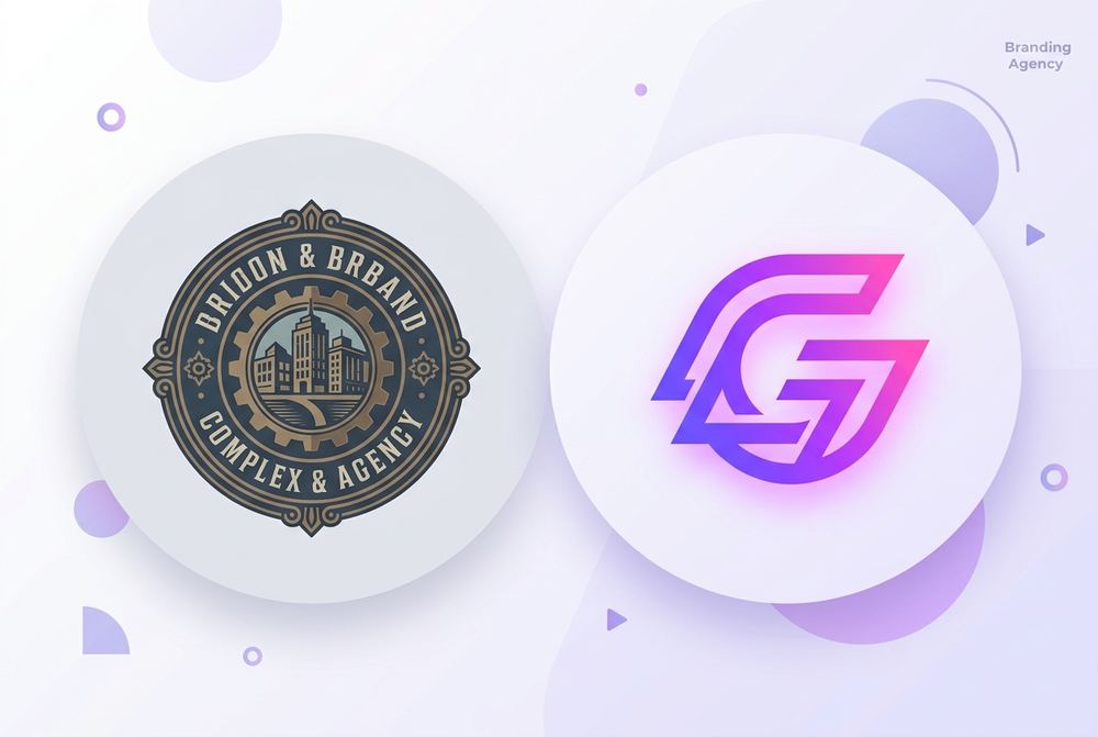
A logo doesn't need to change just because a year has passed. But there are a handful of honest signals that tell you it's time to update your brand identity — and ignoring them usually costs more than fixing them early. Here are five we see most often when businesses come to us for a redesign.
1. It still looks fine in isolation, but terrible everywhere else
A logo that only works as a flat PNG on a white background is already behind. If your logo loses detail at favicon size, turns into a blur on a vehicle wrap, or needs five colours to read properly on a single-colour print job, that's not a "use it carefully" problem — it's a design problem. A logo has to survive shrinking, stretching, printing in one colour, and sitting on a busy photo background.
2. Your business has outgrown it
Plenty of logos are designed for the business a company was on day one, not the one it became. A logo built around "print shop" visuals doesn't always serve a company that now also does branding and web design. If people routinely misunderstand what you do from your logo and name alone, that's a sign worth taking seriously.
3. It looks dated in a way that isn't "classic"
There's a difference between timeless and outdated. Heavy bevels, glossy highlights, harsh drop shadows and overly literal icon styles date a brand quickly. (Subtle, modern gradients are fine — it is the early-2000s effects that give a logo away.) If your logo visually places your business in a specific decade rather than the present, customers notice — especially younger or international ones comparing you to competitors.
- Heavy 3D effects, bevels or glossy "web 2.0" highlights
- Default system fonts, or a font that's been stretched/condensed to fit
- Overly literal clip-art-style icons
- Colours that don't match anything else in your current marketing
Your logo is often the first thing a potential client sees before they read a single word about your business — it's doing sales work before you even speak to them.
4. You can't explain why it looks the way it does
A good logo usually has a reason behind its shape, colour or type choice — even a simple one. If you genuinely can't say why your logo looks the way it does, or it was never really "designed", just assembled, that's usually the clearest sign it's time for a proper identity rather than a patch-up.
5. It doesn't match the rest of your brand anymore
If your website, packaging, social media and signage all use a completely different colour palette or type style than your actual logo, your brand looks disconnected — even if each individual piece looks fine. A refresh is also the right moment to tie everything together into one consistent system, rather than redesigning the logo in isolation again later.
If two or more of these sound familiar, it's worth getting a second opinion before you invest more in marketing material built around a logo that's working against you.